When data is visualized correctly, it can be easy to understand and appealing to look at. That’s why at Wyndetryst Graphic Design Studio, we take data visualization seriously. Our graphic designers work hard to create beautiful and informative graphics that bring your data to life!
The Importance of Visualizing Data
There are many reasons why data visualization is so important. First and foremost, it helps us to make sense of data. When data is presented in a visual way, it can be easier to understand and interpret. Additionally, visual data can be more engaging and interesting to look at than raw data. Data visualization can help us spot trends and patterns that we might not otherwise notice.
At Wyndetryst, we understand the importance of visual data. We also understand that not everyone is a data expert. That’s why we take the time to work with our clients to ensure that their data is presented in the most effective way possible. We’ll help you choose the right chart or graph for your data, and we’ll design it in a way that is both visually appealing and easy to understand.
If you want your audience to connect with your content, you need to provide visual data. With visual data, your information comes to life. Graphic design makes that happen.
How We Visualize Data
There are many different ways we visualize data to tell a story to your audience. Let’s take a look at a few of them!
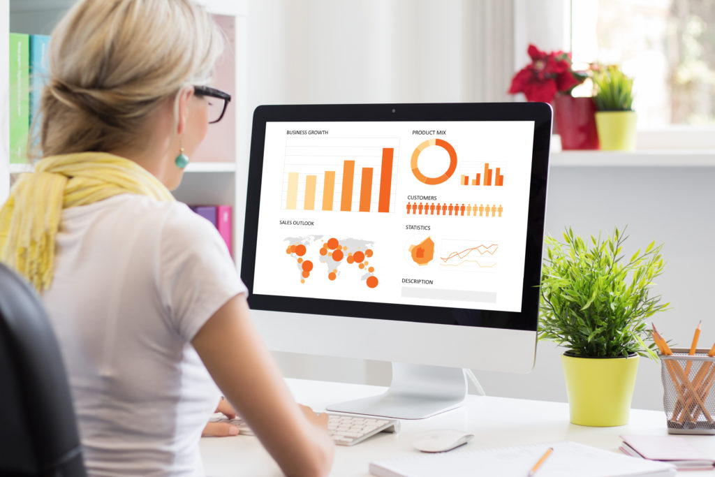
Graphs and Charts
Graphs and charts are a great way to visualize data. They can be used to show comparisons, trends, and relationships. When you’re looking at percentages, it’s easy to show their relationships when using a pie chart. If you’re trying to find trends or patterns in data, it’s sometimes best to use line graphs or scatter plots.
Presentations
Rather than speaking to an audience without any visuals, you can communicate data much easier with a presentation. Wyndetryst Graphic Design Studio can design the perfect slide deck for your presentation. In a good presentation, you don’t need to express your raw data because your slides have the visuals to express them.
Brochures and Pamphlets
Data can be overwhelming. Providing your clients with a pamphlet or brochure to express your data gives them an easier way to understand it. Our graphic designers can visualize your data and make it easily understandable. A printed version of your data brings it to life!
Infographics
An infographic is a great way to take a lot of data and turn it into something that’s easy to understand and visually appealing. An infographic can tell a story with your data and make complex topics easier to understand. Rather than listing raw data, we use infographics to visualize it in an appealing way.
An infographic is the perfect way to take a lot of data and present it in an easily digestible format. We use images, icons, and graphics to tell a story. They’re great for social media because they’re shareable and easy to understand.
How Wyndetryst Brings Data to Life With Graphic Design
At Wyndetryst, we are passionate about helping our clients bring their data to life with beautiful and informative graphics. Our team of professional data visualization graphic designers has the skills and experience necessary to create stunning data visualizations that will help you communicate your data effectively.
Contact us today to learn more about how we can help you with your data visualization needs!