How to Bring Your Data to Life with Graphic Design
At Wyndetryst, we take data visualization seriously and there are many reasons why it is so important. First and foremost, it helps us to make sense of data. When data is presented in a visual way, it can be easier to understand and interpret.
If you want your audience to connect with your content, you need to provide visual data. With visual data, your information comes to life. Graphic design makes that happen.

Data Doesn’t Change Minds. Stories Do.
Life sciences and healthcare organizations are surrounded by data. The challenge isn’t collecting the data. The challenge is communicating it.
Too often, valuable insights get buried in spreadsheets, dense reports, or presentation slides packed with endless bulleted lists. While the information may be accurate, it can be difficult for audiences to quickly understand what it means and why it matters.
That’s where graphic design and data visualization comes in.
Effective design helps transform complex information into clear, engaging visuals that make data easier to understand, easier to remember, and easier to act upon.
Why Data Visualization Matters
Think about the last time someone showed you a slide or brochure with endless paragraphs and bulleted lists.
How much of it do you remember?
Now think about the last time you saw a compelling chart, infographic, or visual report that immediately highlighted a trend or revealed an insight.
Chances are you remember that much more clearly.
Good data visualization helps:
- Simplify complex information
- Highlight trends and patterns
- Improve comprehension
- Increase audience engagement
- Support decision-making
- Make information more memorable
Most importantly, it helps your audience focus on the story behind the numbers instead of getting lost in the numbers themselves.
Start With the Story, Not the Chart
One of the biggest mistakes organizations make is jumping directly into charts and graphs before identifying what they’re trying to communicate.
Before selecting a visual format, ask yourself:
- What is the most important takeaway?
- What action should the audience take?
- What trend or insight matters most?
- Who is the audience?
A physician may need a different level of detail than a patient. An investor may need different information than a sales team.
The best data visualizations aren’t designed around the data itself. They’re designed around the audience and the story you’re trying to tell.
Ways to Visualize Data
There are countless ways to bring data to life. The right solution depends on your audience, goals, and the complexity of the information.
Graphs and Charts
Charts and graphs are often the foundation of data visualization.
When selected and designed correctly, they allow audiences to quickly understand relationships, trends, and comparisons.
Some common examples include:
- Pie charts for percentages and proportional relationships
- Bar charts for comparisons
- Line graphs for trends over time
- Scatter plots for identifying patterns and correlations
The key is choosing the right chart for the right purpose.
Just because a chart can display information doesn’t mean it’s the most effective way to communicate it.
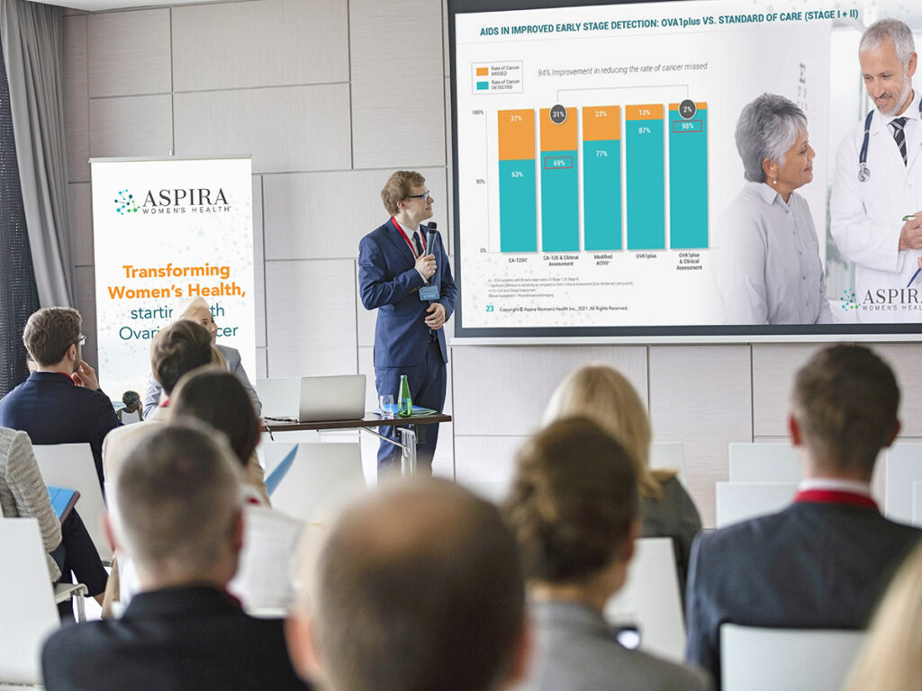
Presentations
Presentations are one of the most powerful tools for communicating data.
Unfortunately, they’re also one of the most common places where data becomes overwhelming.
We’ve all sat through presentations where every slide is packed with charts, tables, and tiny text.
Instead of showing every data point, focus on highlighting the insights that matter most.
Well-designed presentation slides should:
- Guide the audience through a narrative
- Highlight key findings
- Simplify complex information
- Support the speaker rather than compete with them
A strong presentation helps audiences understand what the data means, not just what the data says.
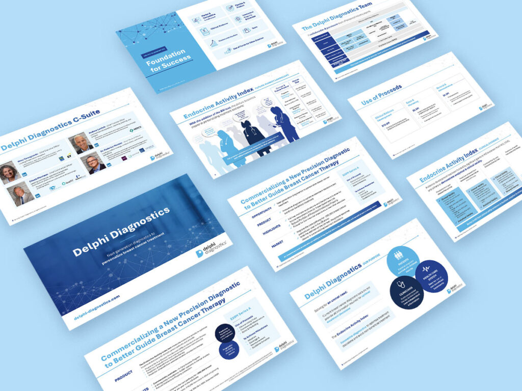
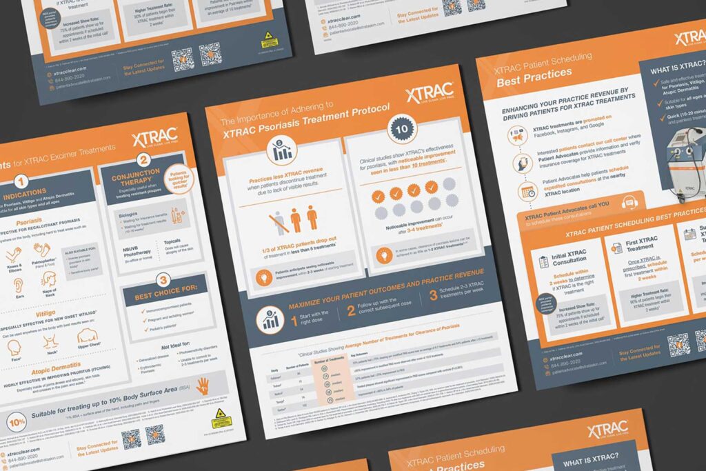
Brochures and Flyers
Brochures and flyers often contain large amounts of information.
Without thoughtful data visualization, these documents can become intimidating and difficult to navigate.
Strategic use of:
- Visual hierarchy
- Callout statistics
- Icons
- Charts
- Color coding
- Data highlights
can make information significantly easier to digest.
This is especially important in healthcare and life sciences, where audiences are often processing highly technical information.
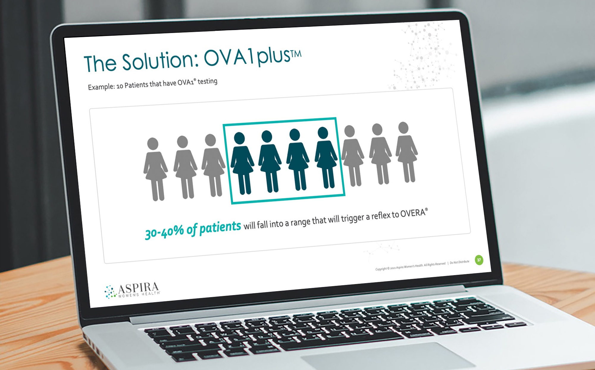
Infographics
Infographics are one of the most effective ways to communicate complex information quickly.
Rather than presenting data as a collection of numbers, infographics transform information into a visual narrative.
A well-designed infographic can:
- Tell a story
- Simplify complex concepts
- Increase engagement
- Improve retention
- Encourage sharing across digital channels
They’re particularly useful for patient education, awareness campaigns, healthcare initiatives, research summaries, and social media content.
When done well, an infographic helps audiences understand information in minutes that might otherwise take several pages to explain.
Bringing Data to Life
Data has the power to inform, persuade, and inspire action.
But only if people can understand it.
The right graphic design doesn’t simplify the science. It clarifies it. It helps your audience focus on what matters most and creates a more engaging experience for everyone interacting with your information.
If your organization is sitting on valuable data that deserves a stronger visual story, we’d love to help. From presentations and reports to infographics and patient-facing materials, Wyndetryst helps life sciences and healthcare organizations transform complex information into clear, compelling communications.
Contact us today to learn more about how we can help you with your data visualization needs!